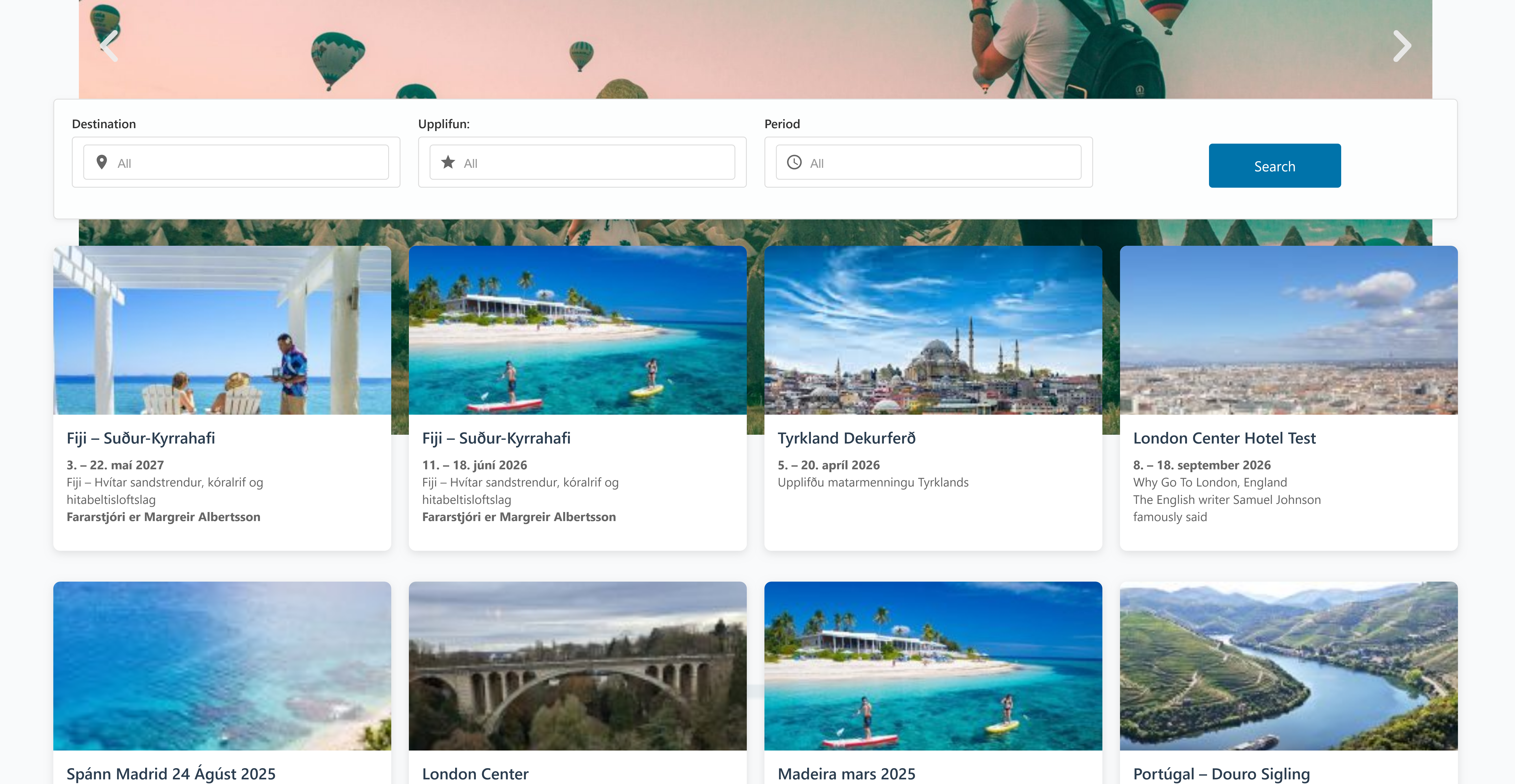
Filter Grid
Discover how to let users filter and explore travel packages with ease.
Filter Grid
Enable visitors to find travel package with a dynamic, responsive filtering interface.
Key Capabilities
- Multi-Criteria Filtering
- Filter by Destination, Experience, and Travel Period.
- Instant Results
- Grid updates in real time as selections change—no page reloads.
- Responsive Layout
- Optimized for desktop, tablet, and mobile devices.
- Customizable Appearance
- Control columns, cards, and overall grid styling to match your theme.
Configuration
Note: Global filter settings live under Settings → Travel Agent → API & Filter.
Block-level options (layout, styling) are available on the Filter Grid block itself.
See the Setup guide for full details.
Layout Options
- Columns: Number of package columns (e.g.
2,3,4). - Items Per Page: Packages shown per page.
- Rows: Maximum rows visible before pagination.
- Card Style: Choose from
Default,Compact,Featured, etc. - Order By: Sort packages by
Date,Unbooked, etc. - Order: Ascending or Descending.
Alignment & Visibility
- Title, Image, Excerpt, Button: Align each element (
Left/Center/Right). - Visibility Toggles: Show or hide title, image, excerpt, and “View Details” button.
Styling
- Colors & Typography: Customize title/excerpt text and background colors, font sizes, and shadows.
- Card & Grid Spacing: Adjust padding, margins, and custom CSS classes.
- Image Settings: Select image size (
Thumbnail,Medium,Large,Full).
Filter Form Appearance
- Form Layout: Width, background, and padding of the filter panel.
- Labels & Placeholders: Custom text for filter labels and dropdown placeholders.
- Row Styling: Background, border, alignment, spacing of filter rows.
- Search Button: Text label, size, border, radius, and hover styles.
Usage
- Add the Filter Grid block to any page or post.
- Configure block settings (layout, alignment, and style).
- Ensure global filters are set under Settings → Travel Agent → API & Filter.
- Publish—users can now refine packages instantly!